")
I’m in love with the cover of The All-Star Antes Up, Book 2 in my Wager of Hearts series. Why? Because it conveys the feel of the story and the series so perfectly, and it’s both attractive and eye-catching.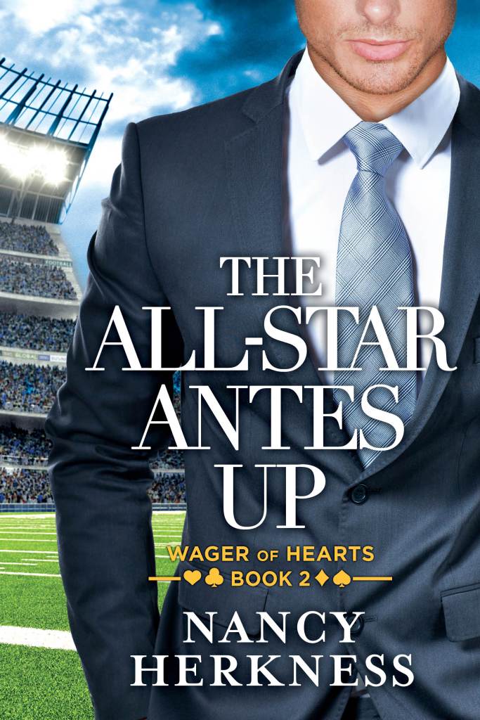
However, creating a successful cover is not easy. Here’s a glimpse of how book covers get designed.
This book is published by Montlake Romance, so they are the folks who hire the cover designer. My editor and I work with her (in this case), going back and forth with concepts, models, backgrounds, layout, fonts, etc. until we all think it works.
My publisher allows me an unusual amount of involvement as the author. Other publishers often ask their authors to fill out the cover questionnaire and go on to design the cover without further input from the writer. Many authors–even bestselling ones!—have a horror story or two to tell about book covers that either misrepresented the story in an important way or were just plain ugly. Christina Dodd famously had a cover for a historical romance on which the heroine had three arms. (Of course, if you self-publish your books, you have total control over the cover, which can be both terrifying and great fun.)
Step 1: As the author, I fill out a questionnaire, answering questions about the hero and heroine’s looks, a pivotal scene, adjectives to describe the tone of the story, as well as any ideas I have about the cover design. I can attach images of other book covers that I think are effective for my subgenre. In addition, The All-Star Antes Up is the second book in a series so it has to match the branding of the series opener, The CEO Buys In.
Step 2: The cover designer comes up with several concepts and sends them to my editor and me. Here’s where you start breaking it down into components:
- The cover model(s);
- The background;
- The title text and font;
- The author name text and font;
- The series logo;
- Colors.
Step 3: My editor and I review the whole effect, as well as the separate elements. In the case of The All-Star Antes Up, the fonts of all the text had to match The CEO Buys In, so that choice was very straightforward. Notice that the color of the series logo was changed on this book, a nice touch. It differentiates this cover from the first book’s just enough to cue the reader that this is a new and distinct story.
In this case, the cover model is very important. He needed to: 1) be blond, 2) exude physical power and confidence, 3) be wearing a suit, and 4) have something that indicated he was a football player. We ended up using one model’s head and a different model’s body to get the right combination of 1-3. As for the sports attribute, the cover designer found such a great football stadium background that we didn’t need to add a football element to the model himself.
Note: I’ve been asked why the model’s full face is not visible. Interestingly, most readers report that they prefer not to be given a visual of the hero/heroine. They prefer to create that image in their own minds. Hence, the faceless covers.
Step 4: My editor and I choose the concept we like the best, but request changes. Repeat Steps 3 and 4 (several times) until we have a front cover we’re happy with. The change requests begin with big things, such as changing the cover model, and end up with tiny tweaks, such as condensing the font spacing slightly to better match The CEO Buys In’s text.
Step 5: The cover designer uses elements from the front cover to design the spine and back cover for the print version of the book. The author is not involved in this part of the design, so it’s an enjoyable surprise when I receive the full cover image.
Step 6: The cover goes to the marketing department for review. They tweaked a font on one of my other books, but that’s the only change I’ve ever received on a cover design from marketing.
Step 7: The cover reveal for The All-Star Antes Up. Woohoo!!!
Absolutely gorgeous covers! It took me a while to get used to the faceless covers idea, but yes I think many people like it that way.
This was really interesting. I didn’t realize you didn’t have complete control over the cover and lettering.
I agree with not having a face on the cover.